Week 7 (4 November 2024)
Week 7
Lecture :
Topic - Double Exposure
covered in Week 5 - press here to see details
Topic - Colour Theory
Our lecture introduced us on colour theory and several concepts that will help to improve the tone of the artwork and create a visual harmony appearance. Understanding these concepts empowers us to apply colour intentionally to deliver messages, establish moods, and increase the impact of our work.
1. RGB - mixture of Red, Green, Blue Light colour (exp: used in TVs, screens, projector)
2. CMYK - mixture of Cyan, Magenta, Yellow, Black colour (exp: used in printing)
3. Hue - pure colour such as Red, Blue, Yellow
4. Shade - add black to make the colour darker
5. Tone - add grey to make the colour softer or more muted
6. Tint - add white to make the colour lighter
7. Monochromatic - using variations of one colour such as tints, shades, tones
8. Colour Harmony - colour combinations that are both attractive and harmonious
9. Analogous - colours next to each other on colour wheel, creating a harmonious look
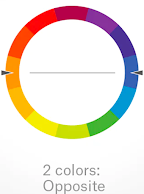
10. Complementary - colours opposite each other on colour wheel, creating contrast and vibrancy
11. Split complementary - use one colour and two nearby colours to create another colour
12. Triadic - Three colours equally spaced on the wheel, offering balance and contrast
13. Colour Psychology - colours affect emotions and behaviour (exp: red = love, blue = loyalty)
14. Warm Colour - red, orange, yellow colours create feelings of happiness, energy, optimism
15. Cool Colour - blue, green, purple colours create feelings of calming, peaceful, distant
16. Black Colour - represents sophistication, power, mystery
17. White Colour - represents purity, simplicity, emptiness
Project 2A - Double Exposure
1. Follow the Week 7 tutorial demo (DOUBLE EXPOSURE)
2. Download the images here:
https://drive.google.com/drive/folders/1lDhDvSaro8tW7XCRa14nOqJO9bDRuqS6?usp=sharing
3. Attach the Project 2A - Double Exposure
a. Part 1 - double exposure follow tutorial
b. Part 2 - my own double exposure
Work:
a. PART 1 - DOUBLE EXPOSURE FOLLOW TUTORIAL
b. PART 2 - MY OWN DOUBLE EXPOSURE


Comments
Post a Comment