Timeframe : Week 1 - Week 3
Instruction
Press Link to View MIB
(A) Describe the design principles & select suitable design examples.
(B) Select and explain the chosen art/design work that piques your interest.
(C) Lecturer's feedback.
(A) Design Principles
1. Gestalt Theory
Gestalt theory is a set of psychological concepts that describe how the human brain naturally organises visual information by viewing things as a whole rather than individual pieces, creating a coherent and meaningful image, even when presented with complex arrangements.
(i) Similarity
Similarity refers to the concept of having multiple elements in a design share visual characteristics such as colour, shape, or size, giving the impression that these elements are related and belong to the same group. Resulting in a sense of visual unity and organisation within the design.
Artist : M.C Escher
Year : 1938
Medium : Woodcut print
Size : 43.66 cm x 43.82 cm
Example : The artwork "Sky and Water I" displays similarities with constant shapes of birds and fish. The elements have similar shapes, sizes and orientations, which creates a sense of unity. The gradual transition from fish to birds ensures visual continuity while establishing the relationship between the two objects.
(ii) Continuation
Continuation is a design idea that outlines how the human eye follows lines, curves, and shapes to perceive a constant flow of visual elements.
Artist : Leonardo da Vinci
Year : 1490
Medium : Ink on paper
Size : 34.4 cm x 25.5 cm
Example : The artwork "Vitruvian Man" illustrates continuation with its circular and square framework, which guides the viewer's eye around the picture. The repetitive limbs generate a visual flow by easily shifting the sight from one position to another, reinforcing movement and connection.
(iii) Proximity
Proximity refers to the concept of arranging similar parts close together visually, so that the observer perceives them as a group, and isolating unrelated pieces to show a lack of connection.
Artist : Saul Bass
Year : 1955
Medium : Lithograph
Size : 102.4 cm x 68.5 cm
Example : The poster "The Man with the Golden Arm" reveals proximity by placing the title text next to the shattered arm graphic. The compact arrangement establishes a strong visual connection, directing the viewer's attention and underlining the concept of struggle and addiction.
(iv) Closure
Closure is a design idea that outlines how people interpret incomplete visual features as complete. It is a Gestalt idea that is commonly employed in logo design, iconography, and web design.
Artist : Paul Rand
Year : 1972
Medium : Graphic design
Size : Scalable digital / print format
Example : The "IBM Logo" exemplifies closure by employing horizontal stripes rather than solid letterforms, allowing the viewer's imagination to fill in the gaps while understanding the entire "IBM" phrase.
(v) Figure/Ground
Figure/ground refers to a visual concept in which elements in a design are divided into a prominent foreground object "figure" and its surrounding background "ground", allowing viewers to easily distinguish the focal point from the rest of the composition. It is a key Gestalt principle used to guide viewer focus and create visual hierarchy.
Artist : Sir Peter Scott
Year : 1961
Medium : Graphic design
Size : Scalable digital / print format
Example : The "WWF Logo" utilises the figure/ground principle, using black shapes to delineate the panda and white space to construct its body, allowing the viewer's imagination to complete the image.
2. Contrast
Contrast refers to the distinct difference between elements within a design, which is created by using opposing elements such as different colours, sizes, shapes, textures, or fonts to create visual interest, emphasise specific components, and draw attention to specific areas of a design. Basically, it is about making elements stand out from each other by placing them next to their opposites.
Artist : Rene Magritte
Year : 1964
Medium : Oil on canvas
Size : 116 cm x 89 cm
Example : The artwork "The Son of Man" demonstrates contrast by contrasting the bright green apple with the dark suit and muted background, bringing focus to the face. The red tie stands out against the neutral tones. Also, the realistic displaying of the man contrasts with the surreal placement of the apple, adding visual interest.
3. Emphasis
Emphasis refers to the technique of directing a viewer's attention and prioritise information by highlighting specific element within a design, creating a focal point by making it stand out through contrast, size, colour, placement, or other visual cues. It is about making one area more prominent than others in order to capture the viewer's attention.
Example : The artwork "Napoleon Crossing the Alps" emphasises Napoleon's central positioning, dramatic posture, and flowing cape. The sharp contrast between his bright clothes and the muted background draws attention to him, while the rearing horse and extending hand emphasise his control and power.
4. Balance
Balance refers to how parts are balanced against one another on different sides of the design to achieve coherence, completion, and satisfaction.
(i) Symmetrical Balance
Symmetrical Balance refers that the work of arts is the same on both sides of a centre line, forming a mirror image.
Artist : Leonardo Da Vinci
Year : 1495 - 1498
Medium : Draw wall-painting
Size : 460 cm x 880 cm
Example : The artwork "The Last Supper" shows symmetrical balance as Jesus is positioned in the centre, serving as a focal point, and six disciples are evenly distributed on each side. The background elements, such as windows and ceiling lines, contribute to the balanced composition.
(ii) Asymmetrical Balance
Asymmetrical balance is a composition where the elements on either side of a central axis are not similar, but still create a visually balanced look by strategically using different sizes, colours, and placements of elements.
Artist : Paul Cezanne
Year : 1839 - 1906
Medium : Oil on canvas
Size : 210.5 cm x 250.8 cm
Example : The artwork "The Large Bathers" shows asymmetrical balance because the figures are placed unevenly, with more visual weight on the right side, which is balanced by the huge trees on the left. The figures' different positions, colours, and sizes result in a dynamic yet harmonious composition without exact symmetry.
(iii) The Golden Ratio
Golden ratio is a mathematical proportion that roughly equals 1.618 in design principles. Designers use this ratio to divide elements within a design in order to create visually pleasing and balanced compositions. It is essentially a guideline to achieve harmony and proportion in layouts, from spacing to element sizes, based on this particular ratio.
Artist : Michelangelo
Year : 1512
Medium : Ceiling plaster
Size : 280 cm x 570 cm
Example : The painting "The Creation of Adam" shows the Golden Ratio by focusing on God and Adam's fingers that are nearly touching. The composition follows the Golden Spiral, which guides the viewer's attention along the curved movement of figures while also generating a sense of balance and harmony.
(iv) Rule of Thirds
The rule of thirds divides the design area into nine equal parts, with two horizontal and two vertical lines that create balance and visual appeal.
Artist : Ivan Aivazovsky
Year : 1850
Medium : Oil on canvas
Size : 221 cm x 332 cm
Example : The artwork "The Ninth Wave" uses the Rule of Thirds by placing the horizon in the upper third, while the survivors on the boat are placed near the lower-right intersection to create balance and guide the viewer's eye towards the dramatic waves and glowing sky.
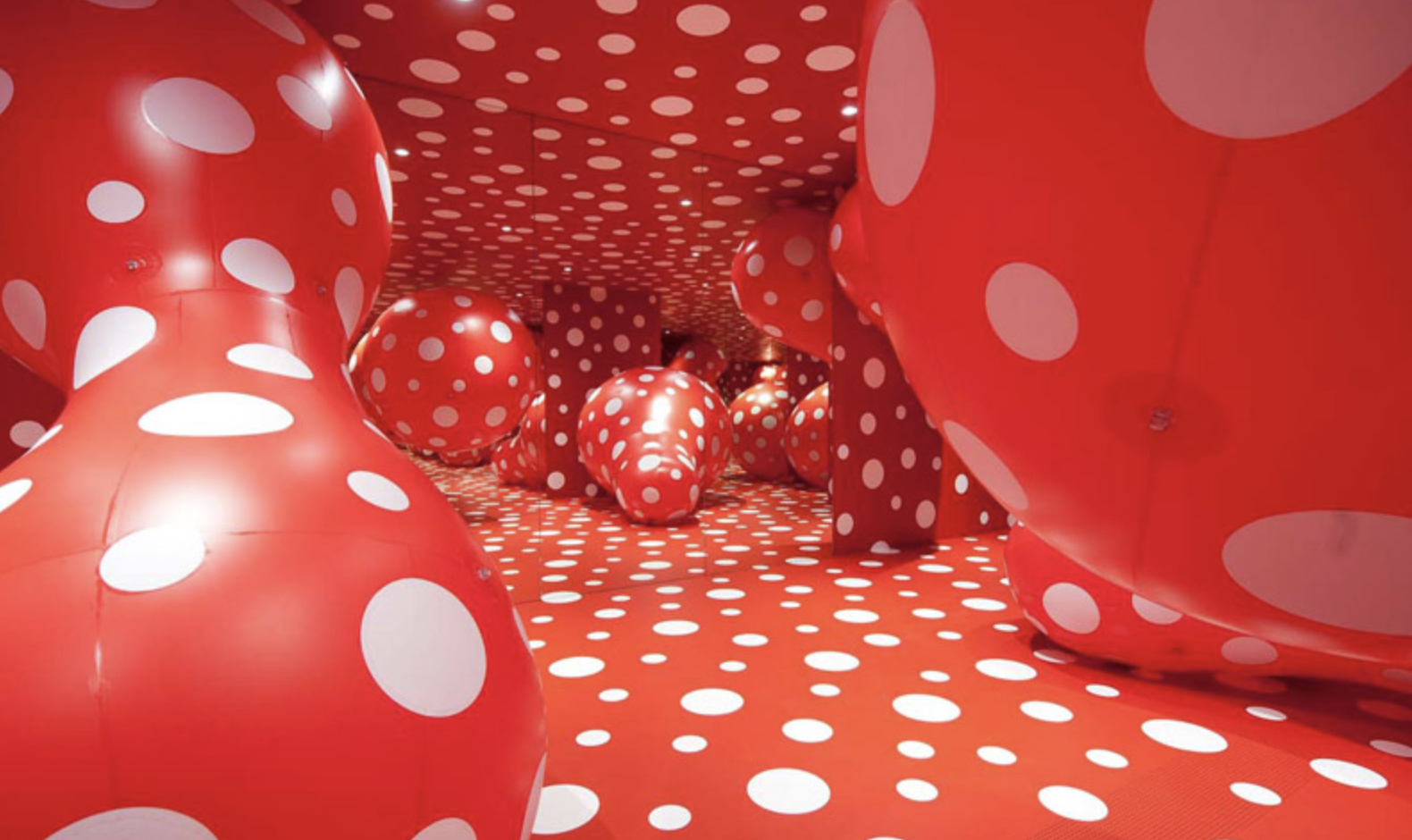
5. Repetition
Repetition happens when similar or identical parts appear several times in a design. It can be utilised to establish consistency, pattern, rhythm, and visual unity.
Artist : Yayoi Kusama
Year : 2000s
Medium : Mixed media (paint, mirrors, installations)
Size : Varies (installation art)
Example : The artwork "Dots Obsession" demonstrates repetition through the consistent use of red and white polka dots across the entire space, creating a visually immersive and rhythmic pattern that enhances unity and movement in the design.
6. Movement
Movement refers to how a viewer's eye navigates through a design, which is frequently accomplished by purposefully positioning lines, shapes, and colours to form a visual path and focus attention to specific areas of the composition. It is how the eye "flows" across a design.

Artist : Henri Matisse
Year : 1910
Medium : Oil on canvas
Size : 260 cm x 391 cm
Example : The artwork "The Dance" displays movement in design through the circular arrangement of people, their flowing limbs, and dynamic poses, creating a rhythmic and continuous motion that moves the viewer's attention across the composition. The use of curving lines and vivid colours adds to the sense of energy and liveliness.
(i) Hierarchy
Hierarchy is the organised arrangement of elements in a design, whereby some elements are visually emphasised to appear more important than others. This arrangement guides the viewer's eye through the composition by conveying the relative importance of each element through the use of factors such as size, colour, contrast, and positioning. It is a system to prioritise information so the most important details can be noticed first.
Artist : J.Howard Miller
Year : 1943
Medium : Poster (Offset Lithograph)
Size : 55.88 cm x 43.18 cm
Example : The poster "We Can Do It !" exemplifies hierarchy with its attention-grabbing bold, big writing at the top. The viewer's eye is directed in order of importance by the strong central figure with a flexed arm, which is the main point and is highlighted by contrasting colours and a plain background.
(ii) Alignment
Alignment refers to the technique of aligning visual elements within a composition so they line up along a common edge or axis, generating a feeling of order, balance, and visual attractiveness by purposefully placing text, images, and other components to crate an organised and unified layout.
Artist : Josef Muller Brockmann
Year : 1959
Medium : Print (Typography and Graphic Design)
Size : Various
Example : The poster "The International Typographic Style" structured grid of black rectangles with yellow outline shows alignment and fosters a sense of unity and order. Besides, the text is neatly aligned to the left, enhancing the geometric composition and enhancing readability.
7. Harmony & Unity
Harmony refers to the pleasing agreement between various elements within a design, creating a sense of visual cohesion ; while Unity means that all elements work together to form a complete and balanced whole, basically showing that every part contributes to the overall design concepts.
Artist : Saul Bass
Year : 1958
Medium : Lithographic print
Size : Standard movie poster dimensions
Example : The poster "Vertigo Movie Poster" exhibits harmony and unity with its powerful text, recurring swirling patterns, and limited colour palette, all of which combine to provide a unified and eye-catching design that captures the psychological tension of the movie.
8. Symbol
Symbol is a sign, shape, or object that serve as communication shorthand, cutting through the clutter of words to quickly convey complicated concepts.
(i) Pictorial Symbol
Pictorial symbol is a visual representation that directly displays a recognisable object or concept, serving as an icon or image that clearly communicates a message without the need for further explanation.
Designer : Otl Aicher and team
Year : 1972
Medium : Graphic design for print, signage and merchandise
Size : Various signage dimensions
Example : The image "Munich Olympics Pictograms" uses pictorial symbols to symbolise several sports using simplified, abstract human models and a minimalist design. The constant use of geometric shapes and black outlines ensures clarity and recognition, making the icons universally understandable in any language or culture.
(ii) Abstract Symbol
Abstract symbol is a visual representation that uses shapes, lines, and colours to convey an idea or concept in a more symbolic and interpretive fashion, rather than clearly portraying a recognisable thing from the real world.
Designer : Carolyn Davidson
Year : 1971
Medium : Graphic design (originally hand-drawn, now digital)
Size : Varies (use across different branding materials)
Example : This symbol "Nike Swoosh" indicates motion, speed, and victory. Its basic curved shape does not represent a physical thing, but rather delivers meaning through form and association, making it iconic and instantly recognisable.
(iii) Arbitrary Symbol
Arbitrary symbol is a symbol that has no inherent visual link to the item it represents, indicating that its meaning is completely dependent on tradition and learnt association, rather than any visual similarity.
Designer : Charles Baldwin
Year : 1966
Medium : Graphic design (digital and print applications)
Size : Varies (used on labels, signs, and protective gear)
Example : The symbol "Biohazard Symbol" has no natural or visual connection to its meaning. Its significance is learned through association, making it a universally recognised warning for hazardous biological materials.
9. Word & Image
Words and images are often combined in design to produce a contrasting effect. Images are better at conveying tangible objects while words are at describing abstract concepts.
Artist: Barbara Kruger
Year: 1987
Medium: Photographic silkscreen on vinyl
Size: 125 cm x 125 cm
Example : The picture "I Shop Therefore I Am" reinforces the theme of consumerism and identity by combining bold, emphatic letters with a cropped hand holding a red card. The visual and conceptual impact is enhanced by the strong contrast between black, white, and red elements.
(B) Chosen Art Work
Artist: Dawn Baillie
Year: 1991
Medium: Print / digital
Size: Standard movie poster size (27 x 40 in)
Why I choose this art work?
I chose "The Silence of the Lambs" movie poster because it is an iconic and masterfully created piece that conveys the film's creepy and psychological depth. The composition's simplicity combined with hidden symbolism, creates an interesting image. The poster stirs curiosity and anxiety, bringing visitors in with its haunting images. It efficiently applies design concepts to make a lasting impact, making it a great example of visual storytelling in graphic design.
Design principles that incorporated in the artwork.
1. Figure/Ground
The woman's face serves as the background, while the death’s-head hawkmoth in the foreground draws attention, creating a visual hierarchy.
2. Contrast
The pale face contrasts sharply with the dark background and the bold red typography, making key elements stand out.
3. Emphasis
The moth is positioned directly over the woman's lips, symbolizing silence and secrecy, reinforcing the film’s theme.
4.Closure
The skull-like pattern on the moth’s back is actually formed by nude human figures, engaging the viewer’s perception.
5. Balance
The symmetrical composition with the centrally placed moth provides a sense of stability while maintaining an eerie, unsettling feel.
(186 words)
(C) Lecturer's Feedback
Mr. Shamsul Hamimi Abdul Rahman:
Integrates information from multiple sources and able to describe the principles accurately. Diligently shares positive progress with lecture in a timely manner.


Integrates information from multiple sources and able to describe the principles accurately. Diligently shares positive progress with lecturer in a timely manner.
ReplyDelete