Task 2 - Visual Analysis & Ideation
Timeframe : Week 3 - Week 5


.jpeg)

Instruction
(A) Visual analysis.
(B) Sketch and describe 3 ideas on how the selected design can be improved.
(C) Lecturer's feedback.
(A) Visual Analysis
Chosen Design From Task 1

Artist: Dawn Baillie
Year: 1991
Medium: Print / digital
Size: Standard movie poster size (27 x 40 in)
Phase 1 - Observation
(Definition : Observation means carefully looking at a design and describing what you see in your own words without jumping to conclusions.)
This movie poster is in portrait format. It features a close-up of a woman's face as the main focus. Her skin is pale, almost ghostly, and her eyes have a weird red hue. The most noticeable element is a large moth covering her mouth, with its wings spread wide. The moth's body bears a distinctive skull-like pattern. The background is plain and fading, so the woman's face and moth are the most prominent aspects. The title of the movie "The Silence of the Lambs" appears at the bottom in strong red and white lettering, with smaller text underneath. The overall colour palette is cool and muted, with the exception of the red in her eyes and the title used for contrast, which contributes to the creepy atmosphere.
(128 words)
Phase 2 - Analysis
(Definition : Analysis is about thinking deeper about what you observed. Look at how the different visual elements (like colours, shapes, and lines) work together to create balance, contrast, movement, or other design principles.)
This design is symmetrically balanced, with the woman's face perfectly centred and the moth positioned above her mouth. The placement of the moth over the mouth suggests suppression, secrecy or the inability to speak, which ties into the film's suspenseful and unsettling atmosphere. The contrast between the pale skin and the dark moth makes the imagery more dramatic. The red eyes give a stunning focal point, enhancing the spooky atmosphere. The figure/ground interaction is strong, with the face and moth standing out against the minimalist background. The skull shape on the moth's body is created through closure, which combines different parts to make a recognisable image. The contrast between light and dark, as well as the organic and geometric shapes, contribute to the poster's terrifying effect. The typography, especially the use of red, adds to the feeling of danger and urgency. Together, these concepts result in a haunting and memorable piece that portrays the film's psychological intensity.
(165 words)
Phase 3 - Interpretation
(Definition : In this final phase, you look at the meaning behind the design, why it was created, and what message it's trying to share. This could include details about the designer, the time period, or the purpose of the work.)
This is a poster designed for a movie "The Silence of the Lambs", a horror film released on 1991 by Dawn Baillie. The story is about a woman who succeeds in a male-dominated world while having to fend off advances, mask her emotions, and minimise her femininity and sexuality. The film explores the power of psychological manipulation and the darkness that can exist within the human mind. I find this poster visually represents the film’s core themes of psychological horror, identity, and death. The moth covering the mouth indicates silence, secrecy, or being voiceless, possibly referencing the protagonist’s struggle or the victims in the film. The death’s-head moth, an iconic symbol of death and transformation, hints at the film’s focus on serial killers, namely Buffalo Bill’s disturbing obsession with transformation. The red eyes may represent danger, fear, or an altered state of mind, reinforcing the film's psychological tension. The pale face gives an eerie, almost ghostly effect, evoking a sense of fear and unease. The dark, fading background creates an unsettling, almost dreamlike quality, emphasising the themes of mystery and psychological depth. Overall, the poster is minimalist yet deeply symbolic, effectively conveying the film’s eerie and unsettling tone.
(198 words)
(B) 3 Idea Sketches
Idea 1 : The Mask of Deception
Design principles - Contrast, Proximity, Visual Hierarchy
By layering Buffalo Bill behind a mask of Clarice, this design highlights deception and psychological duality. The contrast between his unpleasant expression and the smooth mask creates tension. The death's-head moth, positioned over the lips, draws attention to the theme of silence. The strategic placement of elements directs the viewer's attention, enhancing storytelling through visual hierarchy. (54 words)
Visual Reference

Us
Artist: -
Year: 2019
Medium: Digital poster
Size: Various dimensions for print and web
Sketch 1

Idea 2 : Hands of Silence
Design principles - Emphasis, Contrast, Balance
This concept emphasises captivity, fear, and the struggle for freedom, reinforcing the film's psychological intensity by surrounding the restrained figure with outstretched hands, creating a sense of suffocation. The large hand at the top, wrapped with beads, draws attention and adds contrast, reinforcing dominance and control. The combination of symmetry and framing creates balance, while the moth on the character's heart subtly symbolises transformation ad silence. (66 words)
Visual Reference

The Conjuring
Artist: Matt Ryan Tobin
Year: 2013
Medium: Digital illustration / print
Size: 24 x 36 in
Sketch 2
.jpeg)
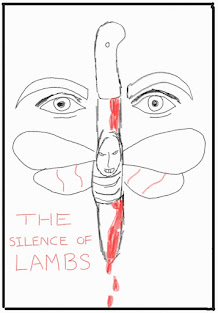
Idea 3 : Blade of Fear
Design principles - Symmetry, Unity, Movement
The knife and moth are combined into a single, cohesive design in this composition, symbolising the violent and transformative elements of the movie. The symmetrical placement of eyes enhances balance while the dripping blood introduces movement, leading the viewer's gaze downward. The reflection of Hannibal Lecter adds a psychological layer, unifying the elements into a striking and memorable visual. (59 words)
Visual Reference

Heaven Becomes Hell
Artist: -
Year: likely from 1970s to 1980s
Medium: Printed poster
Size: Standard movie poster size (27 x 40 in)
Sketch 3

(C) Lecturer's Feedback
Mr. Shamsul Hamimi Abdul Rahman:
You have improved in the ideation. All the sketches are great! I personally like idea 2 and 3.
Can proceed with idea 3. Remember not to totally depend on image only for the final. Need to include text and other graphical element that you create.
---> Press Link To Task 3


You have improved in the ideation. All the sketches are great! I personally like idea 2 and 3
ReplyDeleteSir, can I choose idea 2 as my final selection in Task 3? Also, is it okay to use photoshop to do collage?
DeleteHi Jia Yu, you can proceed with idea 3. Remembe not to totally depend on image only for the final. Need to include text and other graphical element that you create
Delete